

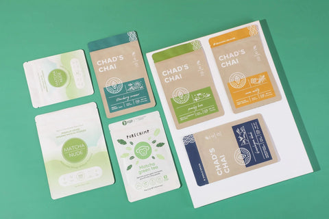
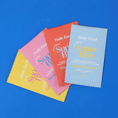
Professional Packaging Begins with Precision Designs
Professional packaging begins long before any ink hits the material. For many growing businesses, investing in custom flexible pouch printing marks a major step forward. It is not only a functional decision but a reflection of brand maturity and attention to detail. Whether introducing a new product or refreshing an existing line, custom packaging enhances perception and delivers a strong first impression. The road to a polished pouch, however, does not start on the production floor. It begins with the design file.
Understand the Flexible Pouch Printing Process
Preparing artwork for flexible packaging is one of the most crucial stages in the entire printing process. This is where creative branding meets technical precision. A well-prepared file ensures accuracy, consistency, and efficiency, helping to avoid costly delays or disappointing results. From understanding the printing method to organizing the layers within your file, careful preparation makes all the difference.
The first step is understanding how the pouch will be printed. Flexible packaging is typically produced using one of two methods: digital printing or rotogravure printing. Each method comes with its own set of requirements and advantages.
Digital printing is often used for short production runs, multiple product variations, or brands experimenting with new visuals. It relies on digital files, which means there is no need to create physical printing plates. This reduces lead time and simplifies the setup process, making it ideal for businesses that require flexibility or operate with quick turnarounds.
Rotogravure printing, by contrast, is best suited for high-volume production. It involves engraving artwork onto metal cylinders, with each cylinder dedicated to a single color. Although this method requires a greater initial investment in time and materials, the payoff is superior print quality and excellent color consistency over long runs. Understanding which method your supplier will use helps inform the file format, color setup, and technical specifications your artwork needs to meet.

Choosing the Right File Format
Once you know the printing method, the next step is ensuring the file format is correct. Vector-based files are the industry standard because they can be resized without losing quality. Formats such as Adobe Illustrator (AI) or properly exported PDFs allow for crisp lines and sharp details. These are essential for elements like logos, text, and other graphic features that need to print cleanly at any scale.
If the design incorporates photographic elements, textured backgrounds, or other raster images, those components must be high resolution. A minimum of 300 dots per inch at actual print size is recommended. Artwork pulled from websites or social media platforms typically does not meet this threshold and can appear pixelated or blurry once printed.
Designing with the Die line
Another key component of print-ready artwork is the die line. A die line serves as the structural blueprint for the pouch. It shows where the material will be cut, folded, and sealed. It also outlines functional elements such as the zipper location, tear notches, and gussets. Within the die line, several critical zones are identified. The bleed area ensures that color or background images extend slightly beyond the trim edge, preventing unwanted white lines. The safe zone ensures that all important text and imagery remain far enough from the edges to avoid accidental trimming.
Designing with the die line in place is non-negotiable. It ensures that the final printed pouch matches the intended design and minimizes production errors. It also allows designers to visualize how the artwork will appear once the pouch is filled and three-dimensional.
Working in CMYK Instead of RGB
Color accuracy is another detail that should not be overlooked. Artwork intended for screen use is often built in the RGB color model, which relies on red, green, and blue light. However, printing uses a CMYK model, based on the mixing of cyan, magenta, yellow, and black inks. If RGB files are submitted without conversion, colors can shift unexpectedly during printing. It is important to work in CMYK from the start to preserve the intended look.
Brands that depend on consistent color from one order to the next may benefit from using the Pantone Matching System. Pantone colors are standardized and help ensure that your shade of red or green looks the same across various materials and production batches. This is especially important for companies producing multiple SKUs or coordinating across different packaging types.
Converting Fonts to Outlines
Typography is another element where preparation matters. Fonts should always be converted to outlines before the file is finalized. This step transforms the text into vector shapes, preserving the layout and style even if the printer does not have the font installed. Any linked images, logos, or graphic assets must be embedded directly in the file. Missing links can cause delays or result in incomplete artwork being printed.

Keeping Layers Organized
File organization plays a major role in the production workflow. Use clearly labeled layers for different components such as background colors, artwork, dielines, and special effects like matte or gloss finishes. If the design includes a clear window, a registered varnish, or white ink beneath certain areas, those elements should be placed on their own separate layers and labeled accordingly. This avoids miscommunication and ensures that each detail is printed accurately.
Many designers recommend creating two versions of the artwork: an editable version that can be updated in the future, and a final production file that is flattened and ready to print. The print file should have all fonts outlined, images embedded, and only the necessary elements included. This file becomes the master version used during the manufacturing process.
Proofing Carefully Before Approval
Once the file is submitted, the printer will typically return a proof for review. This is often sent as a digital PDF or visual mockup. The proofing stage is the last opportunity to catch errors before production begins. Carefully check for issues with spelling, placement, resolution, color accuracy, and die line alignment. This is also the time to confirm that any special features are labeled and positioned correctly.
It is advisable to print the proof on paper and inspect it closely. Zoom in on every detail. Share it with colleagues. What looks fine on a computer screen may reveal problems when reviewed at full size. Addressing these issues early saves time and prevents the expense of a reprint.
Working with a Packaging-Savvy Designer
Finally, if you are working with a graphic designer, choose one with experience in packaging—not just general print or digital media. Packaging design comes with its own unique challenges, from accommodating folds and zippers to anticipating how the artwork will appear on a three-dimensional surface. A designer familiar with packaging will be better equipped to deliver a file that performs well during production and resonates with consumers on the shelf.
Final Thoughts
Custom packaging is a major brand investment. Done right, it captures attention, communicates value, and reinforces brand identity. But all of that hinges on how well the artwork is prepared. Taking the time to set up your file properly, understand print specifications, and follow through with careful proofing can make the difference between a professional result and a costly setback.
When the details are right, the packaging does more than just hold a product. It tells your story clearly, consistently, and with confidence.
Comments (0)
There are no comments for this article. Be the first one to leave a message!